Chapter 26: scikit-learn#
Learning Objectives#
By the end of this lecture, you will be able to:
Use
scikit-learnto perform supervised learningUnderstand the difference between classification and regression
Train and evaluate classification models
Train and evaluate regression models
scikit-learn#
scikit-learn is a Python package that provides simple and efficient tools for data analysis. It is built on numpy, scipy, and matplotlib. It is open source and commercially usable under the BSD license. It is a great tool for machine learning in Python.
Installation#
To install scikit-learn, you can follow the instructions on the official website. You can install it using pip:
pip install -U scikit-learn
Supervised Learning#
In supervised learning, we have a dataset consisting of both input features and output labels. The goal is to learn a mapping from the input to the output. We have two types of supervised learning:
Classification: The output is a category.
Regression: The output is a continuous value.
Classification#
In classification, we have a dataset consisting of input features and output labels. The goal is to learn a mapping from the input features to the output labels. We can use the scikit-learn library to perform classification.
Machine Learning by Example: Wine Classification#
Let’s consider an example of wine classification. We have a dataset of wines with different features such as alcohol content, acidity, etc. We want to classify the wines into different categories based on these features.
Step 1: Get the Data#
First, we need to load the dataset. We can use the load_wine function from sklearn.datasets to load the wine dataset.
import numpy as np
import pandas as pd
from sklearn.datasets import load_wine

data = load_wine()
df = pd.DataFrame(data.data, columns=data.feature_names)
df['target'] = data.target
df.head()
| alcohol | malic_acid | ash | alcalinity_of_ash | magnesium | total_phenols | flavanoids | nonflavanoid_phenols | proanthocyanins | color_intensity | hue | od280/od315_of_diluted_wines | proline | target | |
|---|---|---|---|---|---|---|---|---|---|---|---|---|---|---|
| 0 | 14.23 | 1.71 | 2.43 | 15.6 | 127.0 | 2.80 | 3.06 | 0.28 | 2.29 | 5.64 | 1.04 | 3.92 | 1065.0 | 0 |
| 1 | 13.20 | 1.78 | 2.14 | 11.2 | 100.0 | 2.65 | 2.76 | 0.26 | 1.28 | 4.38 | 1.05 | 3.40 | 1050.0 | 0 |
| 2 | 13.16 | 2.36 | 2.67 | 18.6 | 101.0 | 2.80 | 3.24 | 0.30 | 2.81 | 5.68 | 1.03 | 3.17 | 1185.0 | 0 |
| 3 | 14.37 | 1.95 | 2.50 | 16.8 | 113.0 | 3.85 | 3.49 | 0.24 | 2.18 | 7.80 | 0.86 | 3.45 | 1480.0 | 0 |
| 4 | 13.24 | 2.59 | 2.87 | 21.0 | 118.0 | 2.80 | 2.69 | 0.39 | 1.82 | 4.32 | 1.04 | 2.93 | 735.0 | 0 |
Wine Recognition Dataset
The wine recognition dataset is a classic dataset for classification. It contains 178 samples of wine with 13 features each. The features are the chemical composition of the wines, and the target is the class of the wine (0, 1, or 2). You can find more information about the dataset here.
Your Data
If pandas can read your data, you can swap out the load_wine function with pd.read_csv or any other method you prefer to load your data.
Step 2: Explore and Visualize the Data#
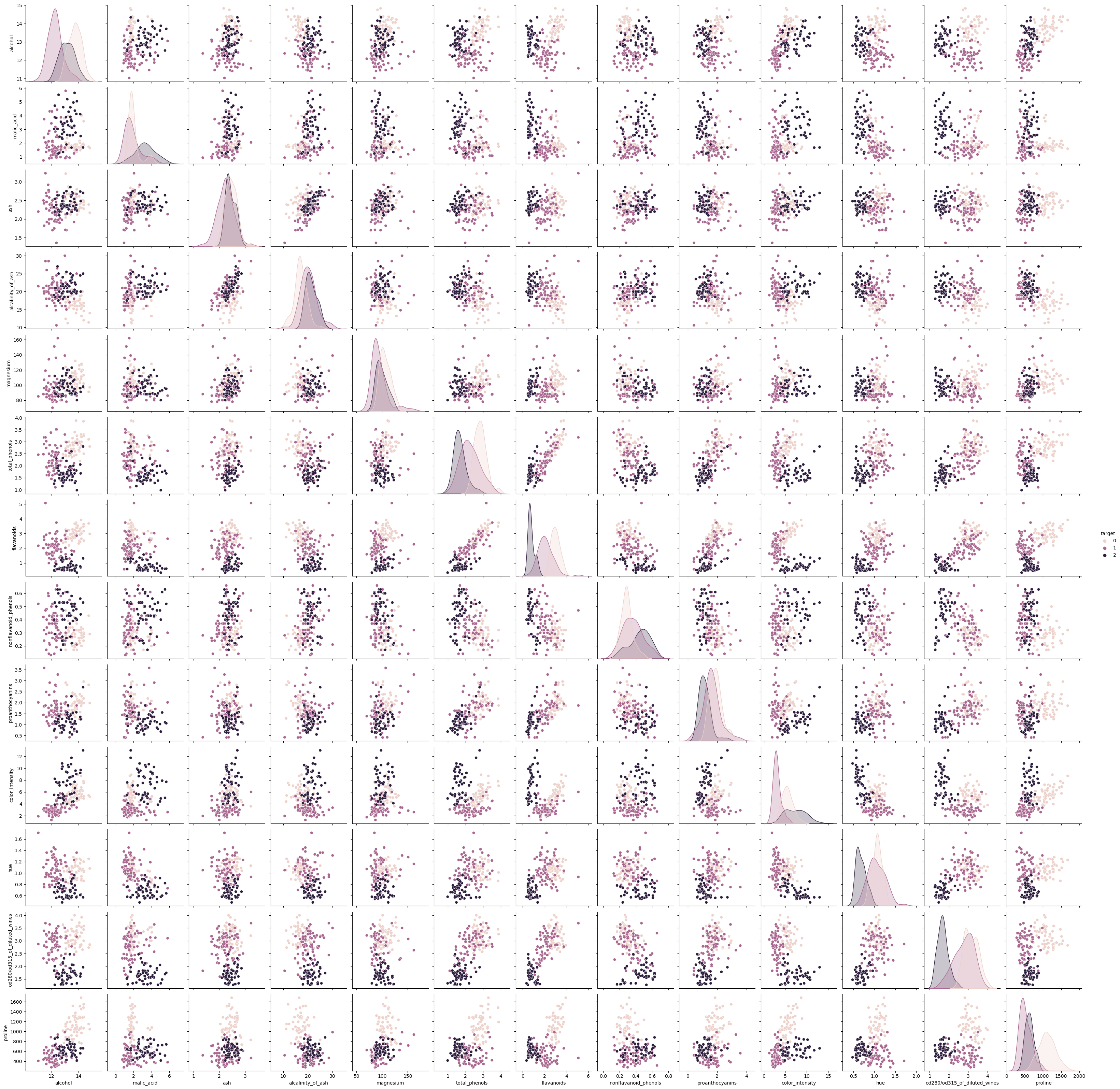
Next, we need to explore and visualize the data to understand its structure and characteristics. We can use pandas to explore the data and seaborn to visualize it.
df.describe()
| alcohol | malic_acid | ash | alcalinity_of_ash | magnesium | total_phenols | flavanoids | nonflavanoid_phenols | proanthocyanins | color_intensity | hue | od280/od315_of_diluted_wines | proline | target | |
|---|---|---|---|---|---|---|---|---|---|---|---|---|---|---|
| count | 178.000000 | 178.000000 | 178.000000 | 178.000000 | 178.000000 | 178.000000 | 178.000000 | 178.000000 | 178.000000 | 178.000000 | 178.000000 | 178.000000 | 178.000000 | 178.000000 |
| mean | 13.000618 | 2.336348 | 2.366517 | 19.494944 | 99.741573 | 2.295112 | 2.029270 | 0.361854 | 1.590899 | 5.058090 | 0.957449 | 2.611685 | 746.893258 | 0.938202 |
| std | 0.811827 | 1.117146 | 0.274344 | 3.339564 | 14.282484 | 0.625851 | 0.998859 | 0.124453 | 0.572359 | 2.318286 | 0.228572 | 0.709990 | 314.907474 | 0.775035 |
| min | 11.030000 | 0.740000 | 1.360000 | 10.600000 | 70.000000 | 0.980000 | 0.340000 | 0.130000 | 0.410000 | 1.280000 | 0.480000 | 1.270000 | 278.000000 | 0.000000 |
| 25% | 12.362500 | 1.602500 | 2.210000 | 17.200000 | 88.000000 | 1.742500 | 1.205000 | 0.270000 | 1.250000 | 3.220000 | 0.782500 | 1.937500 | 500.500000 | 0.000000 |
| 50% | 13.050000 | 1.865000 | 2.360000 | 19.500000 | 98.000000 | 2.355000 | 2.135000 | 0.340000 | 1.555000 | 4.690000 | 0.965000 | 2.780000 | 673.500000 | 1.000000 |
| 75% | 13.677500 | 3.082500 | 2.557500 | 21.500000 | 107.000000 | 2.800000 | 2.875000 | 0.437500 | 1.950000 | 6.200000 | 1.120000 | 3.170000 | 985.000000 | 2.000000 |
| max | 14.830000 | 5.800000 | 3.230000 | 30.000000 | 162.000000 | 3.880000 | 5.080000 | 0.660000 | 3.580000 | 13.000000 | 1.710000 | 4.000000 | 1680.000000 | 2.000000 |
df['target'].value_counts()
target
1    71
0    59
2    48
Name: count, dtype: int64
import seaborn as sns
import matplotlib.pyplot as plt

sns.pairplot(df, hue='target')

plt.show()
Step 3: Preprocess the Data#
Before training the model, we need to preprocess the data. This involves splitting the data into input features and output labels, normalizing the input features, and splitting the data into training and testing sets.
from sklearn.model_selection import train_test_split
from sklearn.preprocessing import StandardScaler

X = df.drop('target', axis=1)
y = df['target']

X_train, X_test, y_train, y_test = train_test_split(X, y, test_size=0.8, random_state=42)

scaler = StandardScaler()
X_train = scaler.fit_transform(X_train)
X_test = scaler.transform(X_test)
Why Split the Data?
Splitting the data into training and testing sets allows us to train the model on one set and evaluate it on another set. This helps us assess the model’s performance on unseen data. You can also use cross-validation to evaluate the model’s performance more robustly.
Why Scale or “Standardize” the Data?
Standardizing the data (e.g., using StandardScaler) ensures that each feature has a mean of 0 and a standard deviation of 1. This can help improve the performance of some machine learning algorithms, especially those that are sensitive to the scale of the input features.
Step 4: Train a Model#
Now that we have preprocessed the data, we can train a classification model. We will use the LogisticRegression and RandomForestClassifier models from scikit-learn.
Logistic Regression
Logistic regression is a linear model used for binary classification. It models the probability of the output being in a particular category. You can find more information about logistic regression here.
Canley, CC BY-SA 4.0 https://creativecommons.org/licenses/by-sa/4.0, via Wikimedia Commons
Random Forest
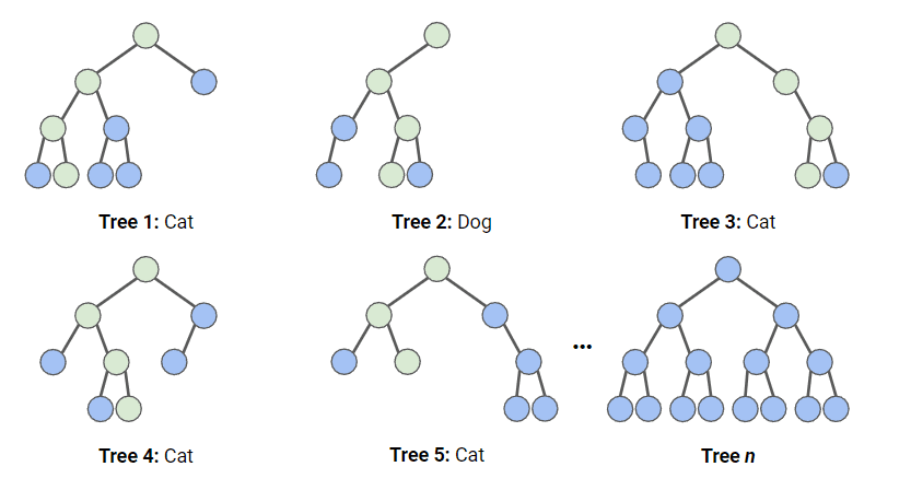
Random forests are an ensemble learning method that builds multiple decision trees during training and outputs the mode of the classes (i.e., the most frequent class) as the prediction. You can find more information about random forests here.
from sklearn.linear_model import LogisticRegression
from sklearn.ensemble import RandomForestClassifier
from sklearn.metrics import ConfusionMatrixDisplay
import matplotlib.pyplot as plt

# Train the Logistic Regression model
lr = LogisticRegression()
lr.fit(X_train, y_train)
y_pred_lr = lr.predict(X_test)

# Train the Random Forest model
rf = RandomForestClassifier()
rf.fit(X_train, y_train)
y_pred_rf = rf.predict(X_test)

# Plot the confusion matrix
fig, ax = plt.subplots(1, 2, figsize=(12, 6))
ConfusionMatrixDisplay.from_estimator(lr, X_test, y_test, ax=ax[0])
ax[0].set_title('Logistic Regression')
ConfusionMatrixDisplay.from_estimator(rf, X_test, y_test, ax=ax[1])
ax[1].set_title('Random Forest')

plt.show()
Confusion Matrix
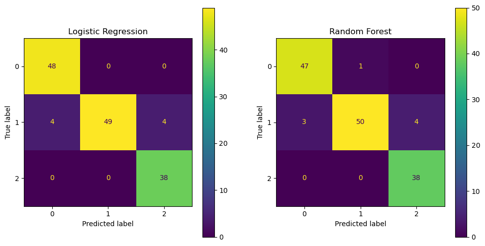
A confusion matrix is a table that is often used to describe the performance of a classification model. It shows the number of true positives, true negatives, false positives, and false negatives. You can find more information about confusion matrices here.
Step 5: Evaluate the Model#
Finally, we need to evaluate the model’s performance. We can use metrics such as accuracy, precision, recall, and F1 score to evaluate the model.
from sklearn.metrics import classification_report

print('Logistic Regression:')
print(classification_report(y_test, y_pred_lr))

print('Random Forest:')
print(classification_report(y_test, y_pred_rf))
Logistic Regression:
              precision    recall  f1-score   support

           0       0.92      1.00      0.96        48
           1       1.00      0.86      0.92        57
           2       0.90      1.00      0.95        38

    accuracy                           0.94       143
   macro avg       0.94      0.95      0.94       143
weighted avg       0.95      0.94      0.94       143

Random Forest:
              precision    recall  f1-score   support

           0       0.94      0.98      0.96        48
           1       0.98      0.88      0.93        57
           2       0.90      1.00      0.95        38

    accuracy                           0.94       143
   macro avg       0.94      0.95      0.95       143
weighted avg       0.95      0.94      0.94       143
Classification Report
A classification report shows the precision, recall, F1 score, and support for each class in the classification model. Precision is the ratio of true positives to the sum of true positives and false positives
Recall is the ratio of true positives to the sum of true positives and false negatives
The F1 score is the harmonic mean of precision and recall
Support is the number of occurrences of each class in the dataset.
Step 6: Plot and Interpret the Coefficients#
For the logistic regression model, we can plot and interpret the coefficients to understand the importance of each feature in the classification.
import numpy as np

# Ensure feature names are a NumPy array
feature_names = np.array(data.feature_names)

# Sort the coefficients
sorted_idx = lr.coef_[0].argsort()

# Plot the coefficients
plt.figure(figsize=(12, 6))
plt.barh(feature_names[sorted_idx], lr.coef_[0][sorted_idx])
plt.xlabel('Coefficient Value')
plt.ylabel('Feature Name')
plt.title('Logistic Regression Coefficients')
plt.show()
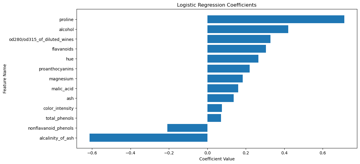
The plot above shows the coefficients of the logistic regression model. The features with the largest coefficients (in absolute value) are the most important for the classification. The sign of the coefficient indicates the direction of the relationship between the feature and the target. The two features with the largest coefficients are proline and alcalinity_of_ash.
proline is the amount of proline in the wine. Proline is an amino acid that is found in high concentrations in red wines. The coefficient for proline is positive, indicating that wines with higher proline content are more likely to be classified as class 2.
Fig. 5 The chemical structure of proline. By Qohelet12, CC0, via Wikimedia Commons#
alcalinity_of_ash is the amount of ash in the wine. Ash is the inorganic residue remaining after the water and organic matter have been removed by heating. The coefficient for alcalinity_of_ash is negative, indicating that wines with lower ash content are more likely to be classified as class 2.
Your Data
You can swap out the wine dataset with your own dataset to perform classification on your data. Make sure to preprocess the data, train the model, and evaluate the model as shown in the example above.
Regression#
In regression, we have a dataset consisting of input features and continuous output values. The goal is to learn a mapping from the input features to the output values. We can use the scikit-learn library to perform regression.
Machine Learning by Example: Oxygen Vacancy Formation Energy Prediction#
Let’s consider an example of regression for predicting the oxygen vacancy formation energy in materials. We have an Excel file containing the features of the materials and the oxygen vacancy formation energy. We want to train a regression model to predict the oxygen vacancy formation energy based on the features of the materials.
Step 1: Use pip or conda to Install openpyxl#
Before we can read the Excel file, we need to install the openpyxl library. You can install it using pip:
pip install openpyxl
Step 2: Get the Data#
First, we need to load the dataset. We can use the pd.read_excel function from pandas to load the Excel file.
df = pd.read_excel('ovfe-deml.xlsx')
df.head()
| xtal_str | comp | dHf | Eg_exp | Eg_GW | Eg_DFTU | O2p_min_VBM | dEN | OVFE_calc | OVFE_reg_GW | OVFE_reg_DFTU | Ehull_MP | |
|---|---|---|---|---|---|---|---|---|---|---|---|---|
| 0 | antifluorite | K2O | -1.30 | NaN | 3.7 | 1.7 | 0.3 | 2.6 | 4.5 | 4.7 | 4.6 | 0.000 |
| 1 | antifluorite | Li2O | -2.10 | 8.017 | 8.2 | 5.2 | 1.5 | 2.5 | 7.1 | 6.5 | 6.4 | 0.000 |
| 2 | antifluorite | Na2O | -1.46 | NaN | 4.3 | 1.9 | 0.5 | 2.5 | 4.9 | 4.8 | 4.6 | 0.000 |
| 3 | antifluorite | Rb2O | -1.18 | NaN | 2.5 | 1.3 | 0.3 | 2.6 | 4.1 | 4.4 | 4.4 | 0.003 |
| 4 | corundum | Al2O3 | -3.44 | 8.818 | 9.1 | 5.9 | 2.6 | 1.8 | 7.0 | 6.9 | 6.8 | 0.000 |
Oxygen Vacancy Formation Energy Dataset
The oxygen vacancy formation energy dataset contains the features of materials and the oxygen vacancy formation energy. The features include the crystal structure (xtal_str), the composition (comp), the standard enthalpy of formation (dHf), the measured and calculated band gaps (Eg_exp, Eg_GW, and Eg_DFTU), the valence band maximum (O2p_min_VBM), the difference between the electronegativity of the cation and anion (dEN), and the energy above the convex hull (Ehull_MP). The energy above the convex hull is a measure of the thermodynamic stability of the material. The higher the energy above the convex hull, the less stable the material. The target is the oxygen vacancy formation energy (OVFE_calc). You can find more information about the dataset here.
Your Data
If pandas can read your data, you can swap out the pd.read_excel function with pd.read_csv or any other method you prefer to load your data.
Step 3: Explore and Visualize the Data#
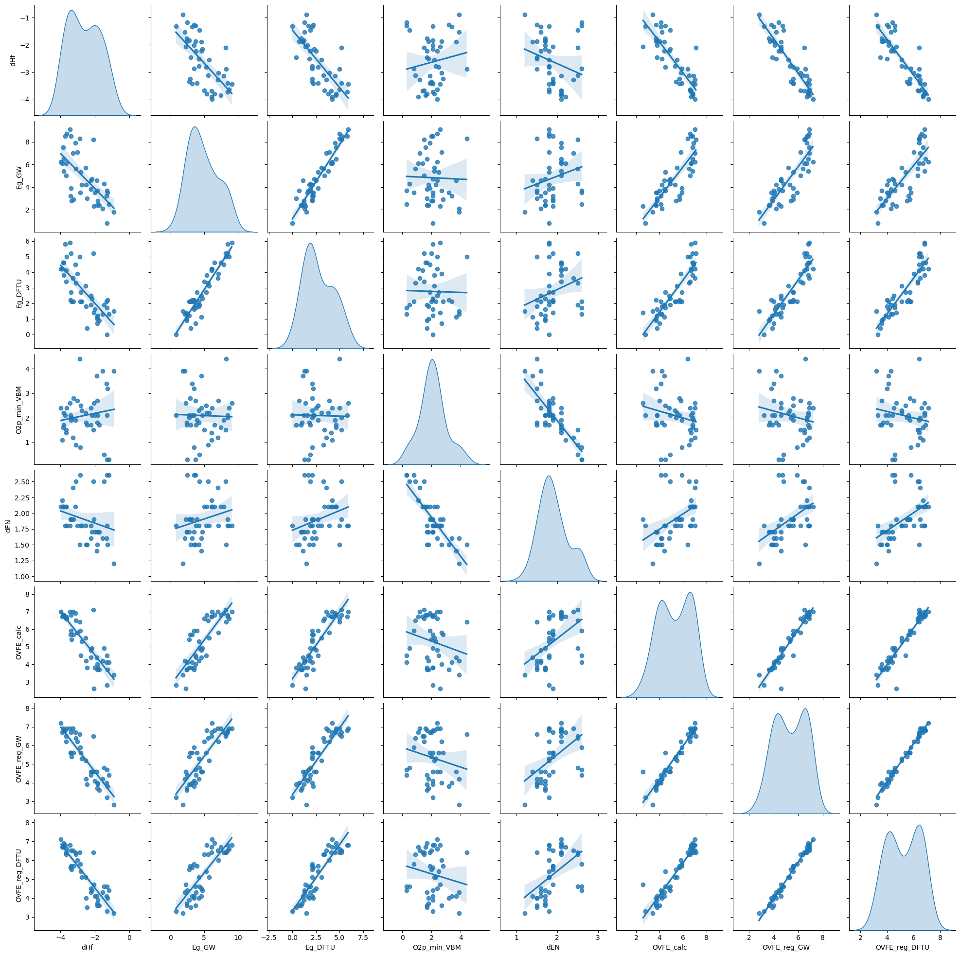
Next, we need to explore and visualize the data to understand its structure and characteristics. We can use pandas to explore the data and seaborn to visualize it.
Missing Values#
Before exploring the data, we need to check for missing values and handle them if necessary.
df.isnull().sum()
xtal_str         0
comp             0
dHf              0
Eg_exp           9
Eg_GW            0
Eg_DFTU          0
O2p_min_VBM      0
dEN              0
OVFE_calc        0
OVFE_reg_GW      0
OVFE_reg_DFTU    0
Ehull_MP         2
dtype: int64
The measured band gap (Eg_exp) and the energy above the convex hull (Ehull_MP) have nine and two missing values, respectively. We can drop these columns or impute the missing values with the mean, median, or mode of the column. Let’s drop the columns for now.
df.drop(['Eg_exp', 'Ehull_MP'], axis=1, inplace=True)
df.head()
| xtal_str | comp | dHf | Eg_GW | Eg_DFTU | O2p_min_VBM | dEN | OVFE_calc | OVFE_reg_GW | OVFE_reg_DFTU | |
|---|---|---|---|---|---|---|---|---|---|---|
| 0 | antifluorite | K2O | -1.30 | 3.7 | 1.7 | 0.3 | 2.6 | 4.5 | 4.7 | 4.6 |
| 1 | antifluorite | Li2O | -2.10 | 8.2 | 5.2 | 1.5 | 2.5 | 7.1 | 6.5 | 6.4 |
| 2 | antifluorite | Na2O | -1.46 | 4.3 | 1.9 | 0.5 | 2.5 | 4.9 | 4.8 | 4.6 |
| 3 | antifluorite | Rb2O | -1.18 | 2.5 | 1.3 | 0.3 | 2.6 | 4.1 | 4.4 | 4.4 |
| 4 | corundum | Al2O3 | -3.44 | 9.1 | 5.9 | 2.6 | 1.8 | 7.0 | 6.9 | 6.8 |
Missing Values
Missing values can affect the performance of machine learning models. It is important to handle missing values appropriately by imputing them or dropping the corresponding rows or columns. You can find more information about handling missing values here.
Data Exploration#
Now, let’s explore the data to understand its structure and characteristics.
df.describe()
| dHf | Eg_GW | Eg_DFTU | O2p_min_VBM | dEN | OVFE_calc | OVFE_reg_GW | OVFE_reg_DFTU | |
|---|---|---|---|---|---|---|---|---|
| count | 45.000000 | 45.000000 | 45.000000 | 45.000000 | 45.000000 | 45.000000 | 45.000000 | 45.000000 |
| mean | -2.620444 | 4.824444 | 2.760000 | 2.093333 | 1.902222 | 5.286667 | 5.333333 | 5.253333 |
| std | 0.904850 | 2.173723 | 1.548665 | 0.901867 | 0.346075 | 1.337841 | 1.245720 | 1.208982 |
| min | -3.980000 | 0.800000 | 0.000000 | 0.300000 | 1.200000 | 2.600000 | 2.800000 | 3.200000 |
| 25% | -3.400000 | 3.200000 | 1.600000 | 1.700000 | 1.700000 | 4.100000 | 4.200000 | 4.100000 |
| 50% | -2.770000 | 4.300000 | 2.200000 | 2.100000 | 1.800000 | 5.400000 | 5.400000 | 5.400000 |
| 75% | -1.870000 | 6.200000 | 4.100000 | 2.500000 | 2.100000 | 6.700000 | 6.600000 | 6.400000 |
| max | -0.890000 | 9.100000 | 5.900000 | 4.400000 | 2.600000 | 7.100000 | 7.200000 | 7.100000 |
sns.pairplot(df, kind='reg', diag_kind='kde')
plt.show()
Step 4: Preprocess the Data#
Before training the model, we need to preprocess the data. This involves splitting the data into input features and output labels, normalizing the input features, and splitting the data into training and testing sets.
X = df.drop(['xtal_str', 'comp', 'OVFE_calc', 'OVFE_reg_GW', 'OVFE_reg_DFTU'], axis=1)
y = df['OVFE_calc']

X_train, X_test, y_train, y_test = train_test_split(X, y, test_size=0.2, random_state=42)

scaler = StandardScaler()
X_train = scaler.fit_transform(X_train)
X_test = scaler.transform(X_test)
Step 5: Train a Model#
Now that we have preprocessed the data, we can train a regression model. We will use the RidgeCV and Perceptron models from scikit-learn.
Ridge regression
Ridge regression is a linear model used for regression. It is similar to ordinary least squares regression, but it adds a penalty term to the loss function to prevent overfitting by shrinking the coefficients. You can find more information about ridge regression here.
Multi-layer Perceptron (MLP)
The multi-layer perceptron (MLP) is a type of artificial neural network that consists of multiple layers of nodes. It is a powerful model that can learn complex patterns in the data. You can find more information about MLPs here.
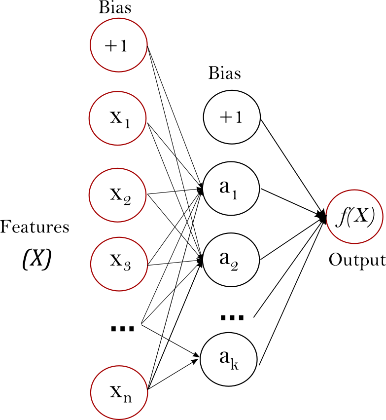
Fig. 6 A multi-layer perceptron (MLP) neural network. Source#
from sklearn.linear_model import RidgeCV
from sklearn.neural_network import MLPRegressor

# Train the Ridge regression model
ridge = RidgeCV()
ridge.fit(X_train, y_train)
y_pred_ridge = ridge.predict(X_test)

# Train the MLPRegressor model
mlp = MLPRegressor(
    hidden_layer_sizes=(100, 50),
    activation='relu',
    solver='adam',
    max_iter=1000,
    random_state=42
)
mlp.fit(X_train, y_train)
y_pred_mlp = mlp.predict(X_test)

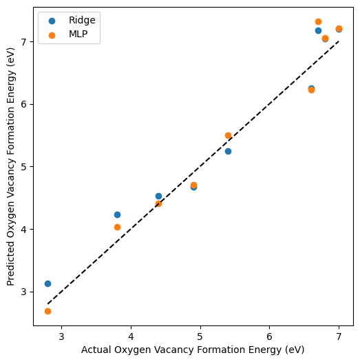
# Plot the predicted vs. actual values
plt.figure(figsize=(6, 6))
plt.scatter(y_test, y_pred_ridge, label='Ridge')
plt.scatter(y_test, y_pred_mlp, label='MLP')
plt.plot([min(y_test), max(y_test)], [min(y_test), max(y_test)], 'k--')
plt.xlabel('Actual Oxygen Vacancy Formation Energy (eV)')
plt.ylabel('Predicted Oxygen Vacancy Formation Energy (eV)')
plt.legend()
plt.show()
Step 6: Evaluate the Model#
Finally, we need to evaluate the model’s performance. We can use metrics such as mean squared error (MSE), mean absolute error (MAE), and \(R^2\) score to evaluate the model.
from sklearn.metrics import mean_squared_error, mean_absolute_error, r2_score

print('Ridge Regression:')
print('MSE:', mean_squared_error(y_test, y_pred_ridge))
print('MAE:', mean_absolute_error(y_test, y_pred_ridge))
print('R^2:', r2_score(y_test, y_pred_ridge))

print('MLPRegressor:')
print('MSE:', mean_squared_error(y_test, y_pred_mlp))
print('MAE:', mean_absolute_error(y_test, y_pred_mlp))
print('R^2:', r2_score(y_test, y_pred_mlp))
Ridge Regression:
MSE: 0.09159773749650606
MAE: 0.2804229419845436
R^2: 0.9547430966376906
MLPRegressor:
MSE: 0.08291662572137254
MAE: 0.2327111597729418
R^2: 0.9590322881332733
Regression Metrics
Mean squared error (MSE) is the average of the squared differences between the predicted and actual values
Mean absolute error (MAE) is the average of the absolute differences between the predicted and actual values
The \(R^2\) score is the coefficient of determination and represents the proportion of the variance in the dependent variable that is predictable from the independent variables
Your Data
You can swap out the oxygen vacancy formation energy dataset with your own dataset to perform regression on your data. Make sure to preprocess the data, train the model, and evaluate the model as shown in the example above.
Step 7: Plot and Interpret the Coefficients#
For the Ridge regression model, we can plot and interpret the coefficients to understand the importance of each feature in the regression.
# Ensure feature names are a NumPy array
feature_names = np.array(X.columns)

# Sort the coefficients
sorted_idx = ridge.coef_.argsort()

# Plot the coefficients
plt.figure(figsize=(12, 6))
plt.barh(feature_names[sorted_idx], ridge.coef_[sorted_idx])
plt.xlabel('Coefficient Value')
plt.ylabel('Feature Name')
plt.title('Ridge Regression Coefficients')
plt.show()
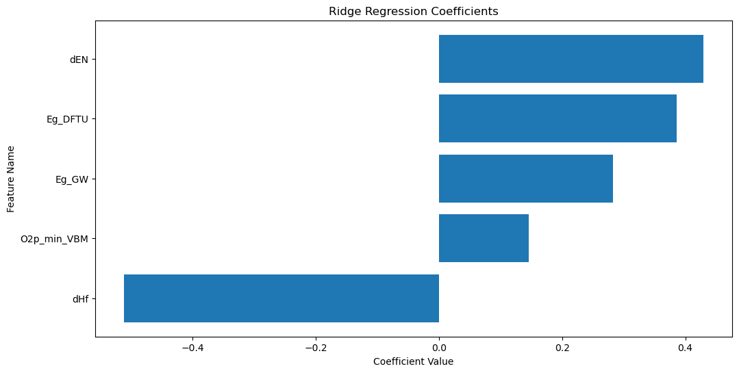
The plot above shows the coefficients of the Ridge regression model. The features with the largest coefficients (in absolute value) are the most important for the regression. The sign of the coefficient indicates the direction of the relationship between the feature and the target. The feature with the largest coefficient is dHf.
Interpretation
dHf is the standard enthalpy of formation of the material. The formation reaction of a metal oxide (MO\(_x\)) can be represented as
This reaction can be thought of as an oxidation reaction, where the metal is oxidized to form the metal oxide, and its standard enthalpy change can be thought of as an enthalpy of oxidation. Since oxygen vacancy formation is a reduction reaction, the oxygen vacancy formation energy is inversely related to the standard enthalpy of formation. The coefficient for dHf is negative, indicating that materials with lower standard enthalpies of formation have higher oxygen vacancy formation energies.
Materials Design
This relationship is exciting because it suggests that we can predict the oxygen vacancy formation energy of metal oxides, which is challenging to measure experimentally, based on their standard enthalpies of formation, which are readily available from databases like the Materials Project, AFLOW, and OQMD. This prediction can help guide the design of materials with desired properties for applications like solid oxide fuel cells, oxygen separation membranes, catalysts, and thermochemical water and carbon dioxide splitting.
Summary#
In this lecture, we learned how to use scikit-learn to perform supervised learning. We covered classification and regression and trained models on the wine recognition dataset and the oxygen vacancy formation energy dataset. We explored the data, preprocessed it, trained the models, evaluated the models, and interpreted the results. We used logistic regression and random forests for classification and ridge regression and MLPRegressor for regression. We also visualized the data, plotted the confusion matrix, and interpreted the coefficients.
